
The Simple Contrast Tool That Makes My Photos Pop
It’s neither the contrast slider, nor the curves tool

I’ve always been a big fan of color transparency film. The rich, saturated colors and deep blacks always seemed to jump out at me whenever I’d view my slides on a lightbox with a loupe. Slide film, however, was quite constraining. It had very little latitude; shadows and highlights both clipped easily (especially with emulsions like Fujichrome Velvia). That being said, when you got it right in the camera, those photos just popped.
When I started to work with digital files more seriously, I wanted my photos to have the same impact. I’ve always considered a digital raw capture to be the best of both worlds; an “undeveloped” image with far more tonal range than film, but something that can be processed to look like whatever style you like. I can process my images to have the same punchy colors as slide film while retaining subtle shadow tones that would have been lost on the film.
That brings me to contrast adjustments. The overall contrast in your image is affected by several things:
Base conversion profile (camera profile)
Tonality adjustments (whites/blacks/highlights/shadows
Direct contrast adjustments (contrast slider)
Curves adjustments
As a general rule, it’s easier to add contrast to a photo than to remove it. I prefer using low-contrast camera profiles (eg, Adobe Neutral or Camera Neutral) as the starting point for my image processing. These profiles open up the shadows and recover highlights without me having to touch a single slider. The next step, then, is how to add the contrast back to the image in a pleasing way. Here is where I’ve found an unlikely ally: The Dehaze slider.
The Dehaze tool was introduced into the Adobe line of photo editors (ACR/Lightroom) back in 2015, as a way of improving contrast in hazy or foggy images. Since then, I’ve started to use it as my primary global* contrast adjustment tool, especially with landscape and nature photos. I think it helps deliver the punch I was so used to seeing in my color transparency photos.
The Contrast and Dehaze sliders both affect image contrast and color, but they do so in strikingly different ways. The Contrast slider tends to block up shadows quickly while leaving highlights alone. The Dehaze slider really does a number on highlight areas, especially in washed-out skies.
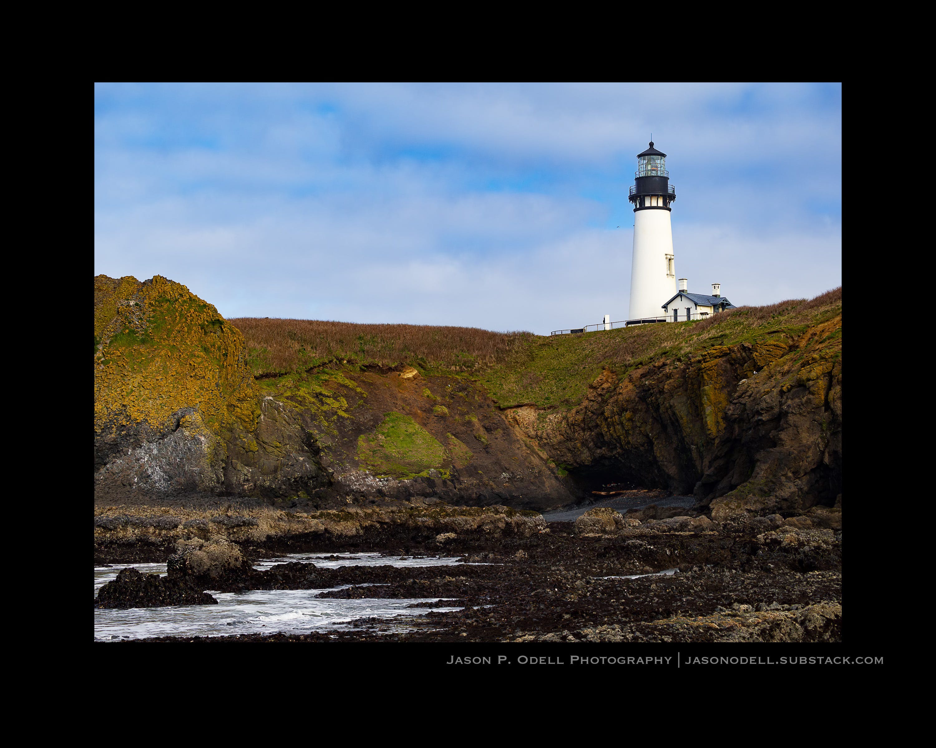
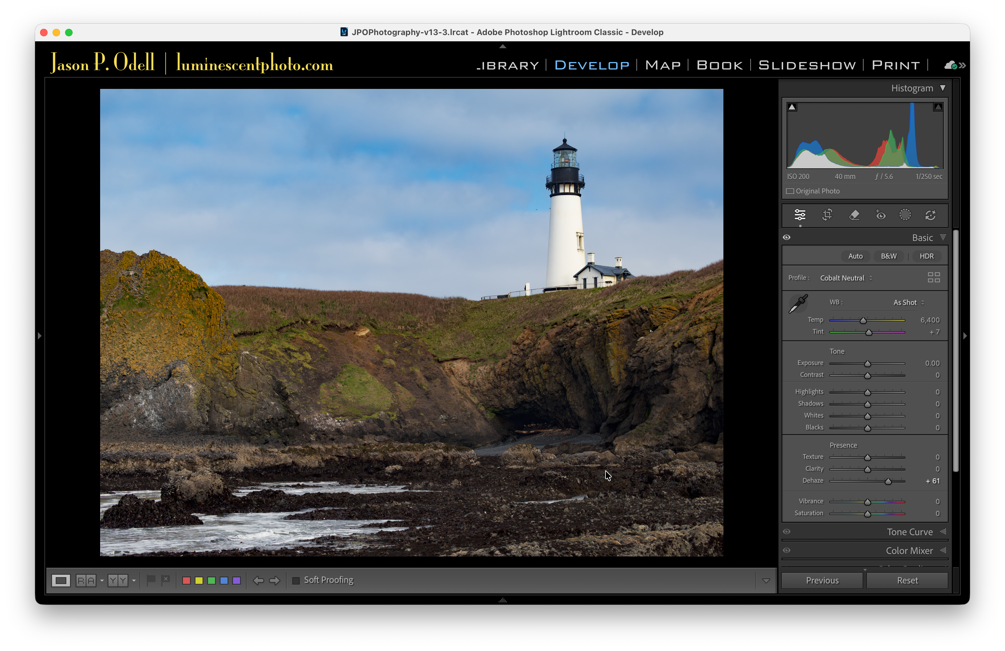
Here’s a photo of the Yaquina Head lighthouse near Newport, Oregon. My only adjustment so far was to change the camera profile from Adobe Color to my preferred custom profile, Cobalt Neutral.
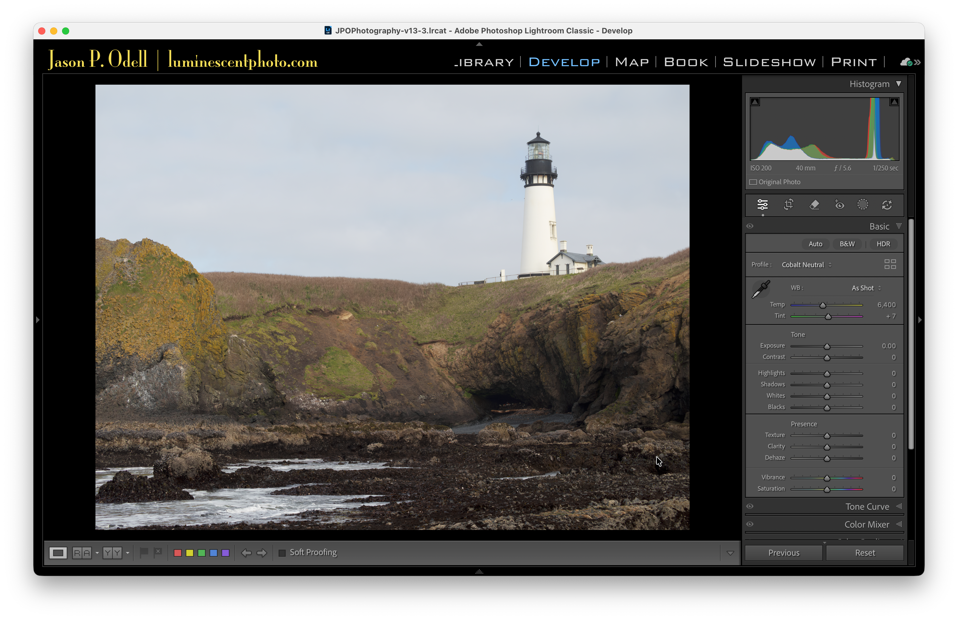
The image is pretty flat-looking, which is perfectly fine for a starting point when processing raw images. Here’s what happens when I crank up the Contrast slider:
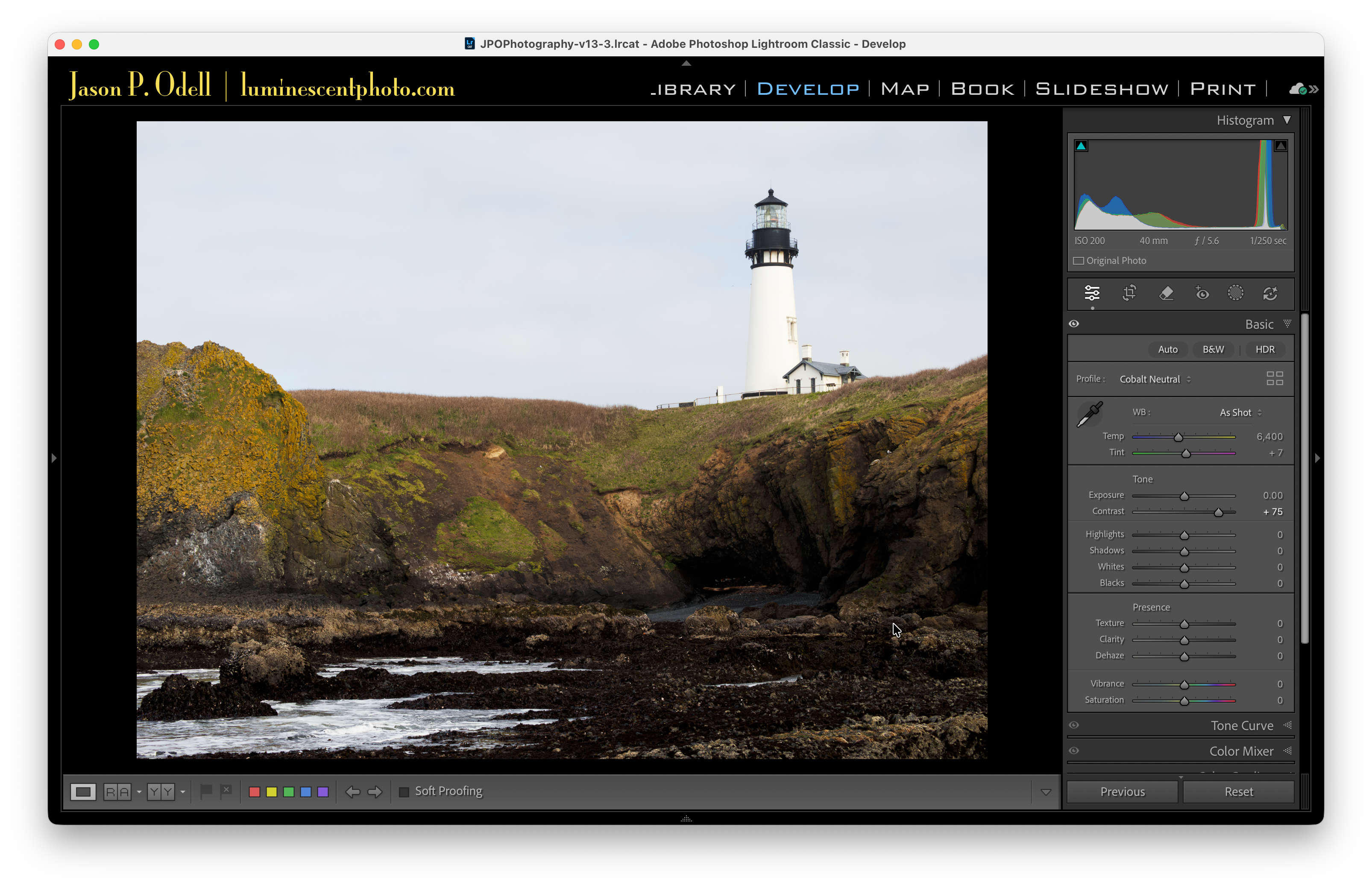
With the strong (+75) contrast setting, the foreground rocks get much darker and some of the shadow detail gets lost, while the sky remains virtually unchanged. Now let’s see what happens when I use the Dehaze slider to adjust contrast instead:
Boom! Suddenly the sky has color and definition that wasn’t really noticeable before. The foreground still has good contrast, too. If I didn’t do anything else to this photo, it’s already a massive improvement over the original.
Tips for using the Dehaze tool
When using the Dehaze tool, keep the following in mind:
The Dehaze effect can be quite strong. Use it sparingly, especially when making global adjustments. It helps to start with a low-contrast image.
The Dehaze tool can cause strange color shifts if used too strongly. It also tends to really bring out blues. To counteract the blue shift, dial back the blue saturation from the Color Mixer tool, or reduce Vibrance slightly.
When used in the negative direction, the Dehaze tool actually creates fog/haze! Don’t be afraid to experiment.
Use Dehaze with a Sky selection mask to improve a weak sky.
Hold down the Alt/Option key while dragging the Dehaze slider to get a threshold clipping view of lost highlights/shadows.
*Global adjustments are those that get applied to the entire image.
Really solid observation about using Dehaze for global contrast instead of the Contrast slider. The diferential impact on highlights vs shadows is something alot of folks miss. I used to just jack up the contrast slider and then fight with recovering blown skies. This approach of prioritzing the Dehaze tool kinda flips the workflow in a way that makes way more sense for landscapes.
I use dehaze on skies a lot.